ABOUT
—
I loved the fact the Violette had enlisted Pascal as part of the set up of Violette right from the start. It’s given the label a real visual identity over the years
The first I saw of this was with their initial release of Mick Head and the Red Elastic band’s ‘Adios’ album. I loved the design. Subsequently, over the years, I’d admired from afar, all the posters for the Violette Società nights and the simplistic but aesthetically pleasing elp series from the label.
So when it came to be that I would release my first album in 20 years on Violette Records, I was really looking forward to seeing how the design process of the sleeve would pan out.
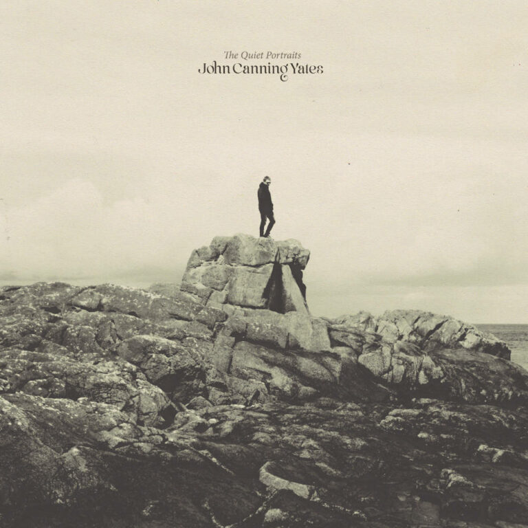
I had a few ideas and I would send images to Pascal. He was honest and we worked through ideas that might work, or didn’t work. It was a process that was easy, as Pascal is so great to get along with. In getting to know him, I learned how deeply he cares about music. This is at the heart of the design process. Along with Matt at Violette, it was a real collaborative effort in coming to a decision on what should be the final design. I didn’t intend to be on the sleeve, but when I showed them a photo that my sister AP Yates, had taken of me on a rock in Northern Ireland, it set the wheels in motion.
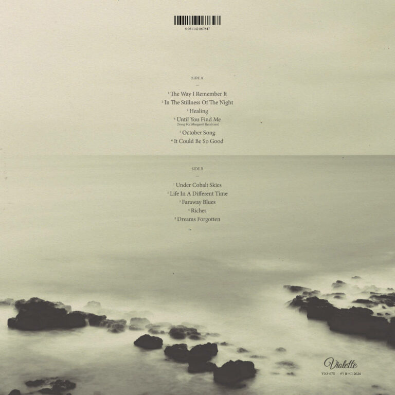
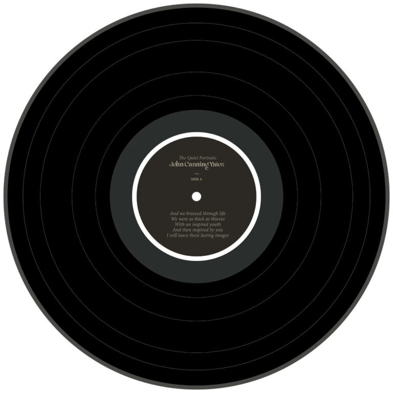
We’d stumbled upon an image and a world that the music could exist within. I loved seeing the care and attention to detail that Pascal put into the whole design of the record sleeve. Numerous mock ups and crucially time (this wasn’t a rushed thing), led to the final sleeve design which I now proudly hold in my hand, a beautiful design with a matt sleeve, design to age beautifully along with the record.
There’s been a few comments already mentioning that it has the feel of a classic album sleeve. Now it’s all done and out in the world, I would whole heartedly agree. It’s lovely to work with Pascal.
John Canning Yates
April 2024


